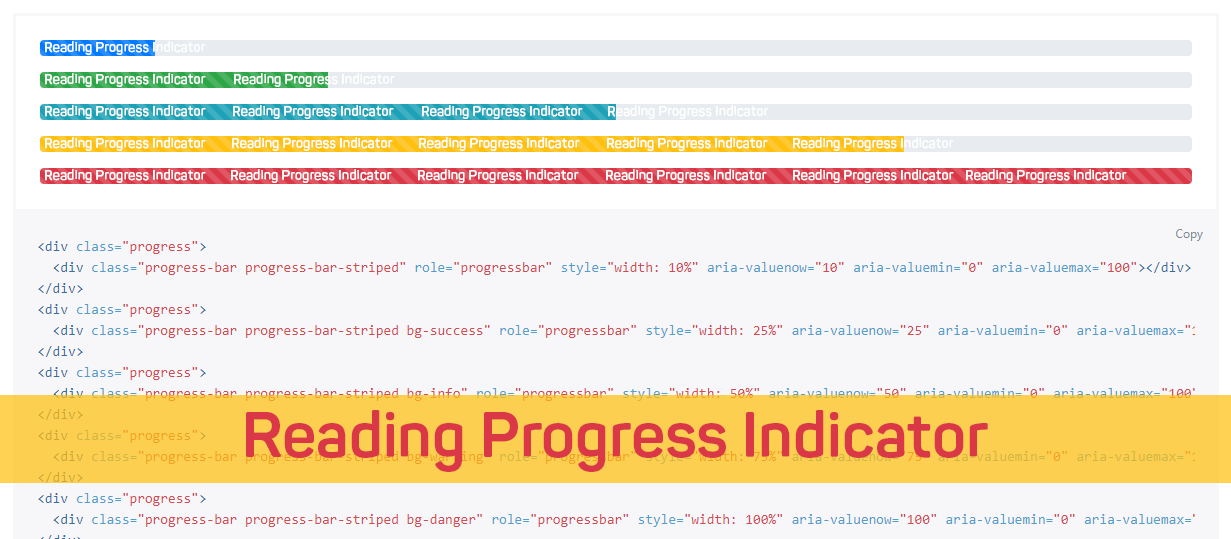 After a long break of writing about coding & web elements, today I came up with the great design technique to grab user's attention to page's UX Design, yes I'm talking about Reading Position Indicator (RPI). I've seen quite a few web pages that have some kind of an indicator to display the current reading position. Normally, such a Reading Position Indicators are used on blog posts or long-form articles and help users to understand how far they are from finishing the reading but you may also find it Chrome's android application in the form loading bar (and Apple's browser Safari, a very similar looking loading bar).
Principle behind this technique
Developer of plugins uses the simple technique by following the fact that the user must have to scroll the page if he/she wishes to read complete article or browse the whole webpage. The technique he used revolves around the scroll event which is likely to be the key to determine an approximate position of the reader.In this post, we will learn how to add Reading Position Indicator to blogger blog, to apply it we have to follow the simple steps:
- Sign in Blogger > Template > Backup template
- Click "Edit HTML"
- Just above
<script type="text/javascript" src="https://cdnjs.cloudflare.com/ajax/libs/jquery/2.1.3/jquery.min.js"></script>
<script type='text/javascript'>
//<![CDATA[
$(document).ready(function(){
var getMax = function(){
return $(document).height() - $(window).height();
}
var getValue = function(){
return $(window).scrollTop();
}
if('max' in document.createElement('progress')){
// Browser supports progress element
var progressBar = $('progress');
// Set the Max attr for the first time
progressBar.attr({ max: getMax() });
$(document).on('scroll', function(){
// On scroll only Value attr needs to be calculated
progressBar.attr({ value: getValue() });
});
$(window).resize(function(){
// On resize, both Max/Value attr needs to be calculated
progressBar.attr({ max: getMax(), value: getValue() });
});
}
else {
var progressBar = $('.progress-bar'),
max = getMax(),
value, width;
var getWidth = function(){
// Calculate width in percentage
value = getValue();
width = (value/max) * 100;
width = width + '%';
return width;
}
var setWidth = function(){
progressBar.css({ width: getWidth() });
}
$(document).on('scroll', setWidth);
$(window).on('resize', function(){
// Need to reset the Max attr
max = getMax();
setWidth();
});
}
});
$(document).ready(function(){
$('#flat').addClass("active");
$('#progressBar').addClass('flat');
$('#flat').on('click', function(){
$('#progressBar').removeClass().addClass('flat');
$('a').removeClass();
$(this).addClass('active');
$(this).preventDefault();
});
});
//]]>
</script>
2. Search for following the code or somewhat similar:
<b:includable id='post' var='post'> <article class='post hentry'>Note: You may not be able to find the same code, but you have to the below code just before starting your article content to allow script calculate the content area.You can ask your questions in the comment form below
3. and add the following code just below the code above or the below the code similar to it:
<progress id='progressBar' value='0'>Great! Now it's time to stylize the progress bar, so let's add some spicy CSS code to our template StyleSheet.
<div class='progress-container'>
<span class='progress-bar'/>
</div>
</progress>
4. Search for the following line of code:
]]></b:skin>
5. Finally, add the following code just above the code:
/* reading position indicator */We have options to change the color of progress bar if you want:
progress {
/* Positioning */
position: fixed;
left: 0;
bottom: 0;
z-index: 101;
/* Dimensions */
width: 100%;
height: .25em;
/* Reset the apperance */
-webkit-appearance: none;
-moz-appearance: none;
appearance: none;
/* Get rid of the default border in Firefox/Opera. */
border: none;
/* For Firefox/IE10+ */
background-color: transparent;
/* For IE10+, color of the progress bar */
color: red;
}
progress::-webkit-progress-bar {
background-color: transparent;
}
.flat::-webkit-progress-value {
background-color: red;
}
.flat::-moz-progress-bar {
background-color: red;
}
.progress-container {
width: 100%;
background-color: transparent;
position: fixed;
top: 0;
left: 0;
height: .25em;
display: block;
}
.progress-bar {
background-color: red;
width: 50%;
display: block;
height: inherit;
}
- To change the background colour of progress bar edit background-color: red;
- To change the height of the progress bar edit height: .25em;
We have options to change the color of progress bar if you want:
The credit of this plugin goes to Pankaj Parashar, he wrote the great in-detail article on CSSTricks.
Would love to hear your feedback on this little effort.I tried my best to create a user-friendly tutorial but if there is anything troubling you, please don't hesitate to ask your question in the comment form below, would love to solve as soon as time allows. Peace & Blessing! :)
 on
on
Hi! What a great article. Thanks so much for writing it! Now, I have a question. I followed your steps - but the indicator is positioned at the very bottom of the screen! I have tried to understand why by looking at the code, but I cannot. Can you explain why this happens? The blog is here:
ReplyDeletehttps://thomasjrmmmm.blogspot.com/
Hi Thomas,
DeleteSo sorry for very late reply to your query, just the bottom: 0; with top: 0; to alight the progress bar at top of your blog, as shown below:
progress {
/* Positioning */
position: fixed;
left: 0;
top: 0;
z-index: 101;
Thank you
Let me know if you face any error..
Also, I cannot change the colour of the progress bar (it turns out blue), even though I did not change your code (which says red). Any idea why? I would really appreciate your answer! =)
ReplyDeleteHi Thomas,
DeleteJust add the following script before this > "//]]> </script>"
$(document).ready(function(){
$('#flat').addClass("active");
$('#progressBar').addClass('flat');
$('#flat').on('click', function(){
$('#progressBar').removeClass().addClass('flat');
$('a').removeClass();
$(this).addClass('active');
$(this).preventDefault();
});
});
I hope it will work.. i will also update the code above..
Hi, it's working perfect but I have a doubt, is it possible to stablish a flexible linear gradient starting from red, orange, brown and finally green?
ReplyDeleteHello,
DeleteGenerate the gradient from online tool and simply replace the colour code with gradient..
I have installed it and the % does not work correctly because of 'lazy load images'. Is there a way to make it work with 'lazy load image'?
ReplyDeleteWould you please share the link where you have installed the plugin?
DeleteI installed here (recetasmallorquinas.es) The problem is on the main page, because have many images. Is it possible to remove the bar only from the main page?
DeleteIt didn't work for me. I have notable theme. When I save it says some adsense1 error.
ReplyDeleteHi Manjeet,
Deleteshare your blog url and screen of the code you have pasted in your html code.
Here is my email
Support at spicyblogging dot com